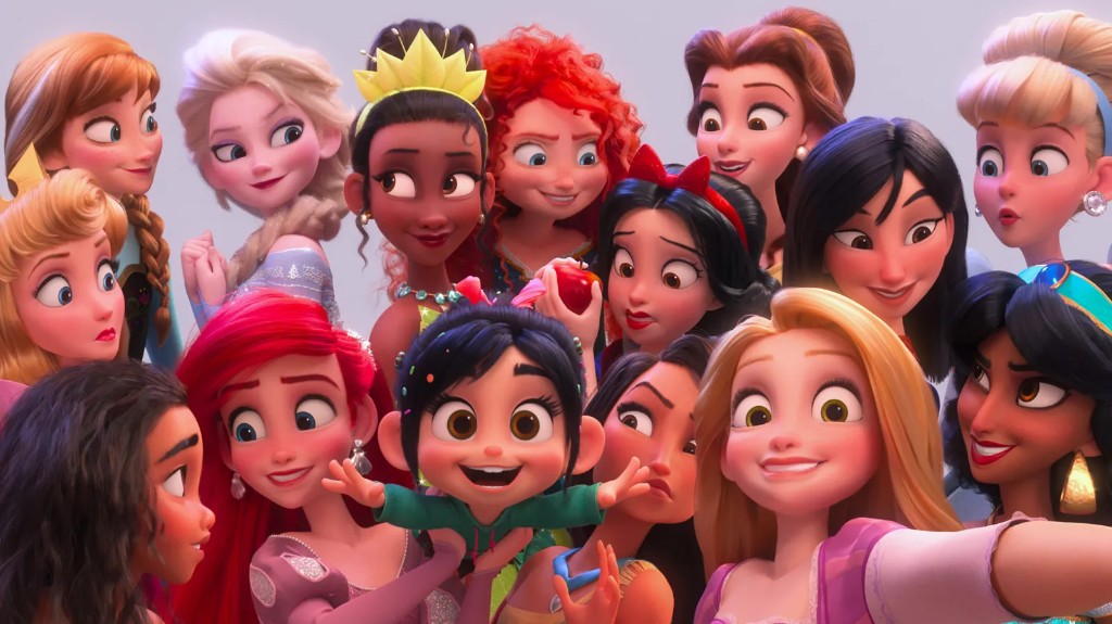

Designing character pages for SEO growth and discovery on mobile.
This work is protected.
Please reach out if you'd like to chat!
What broke
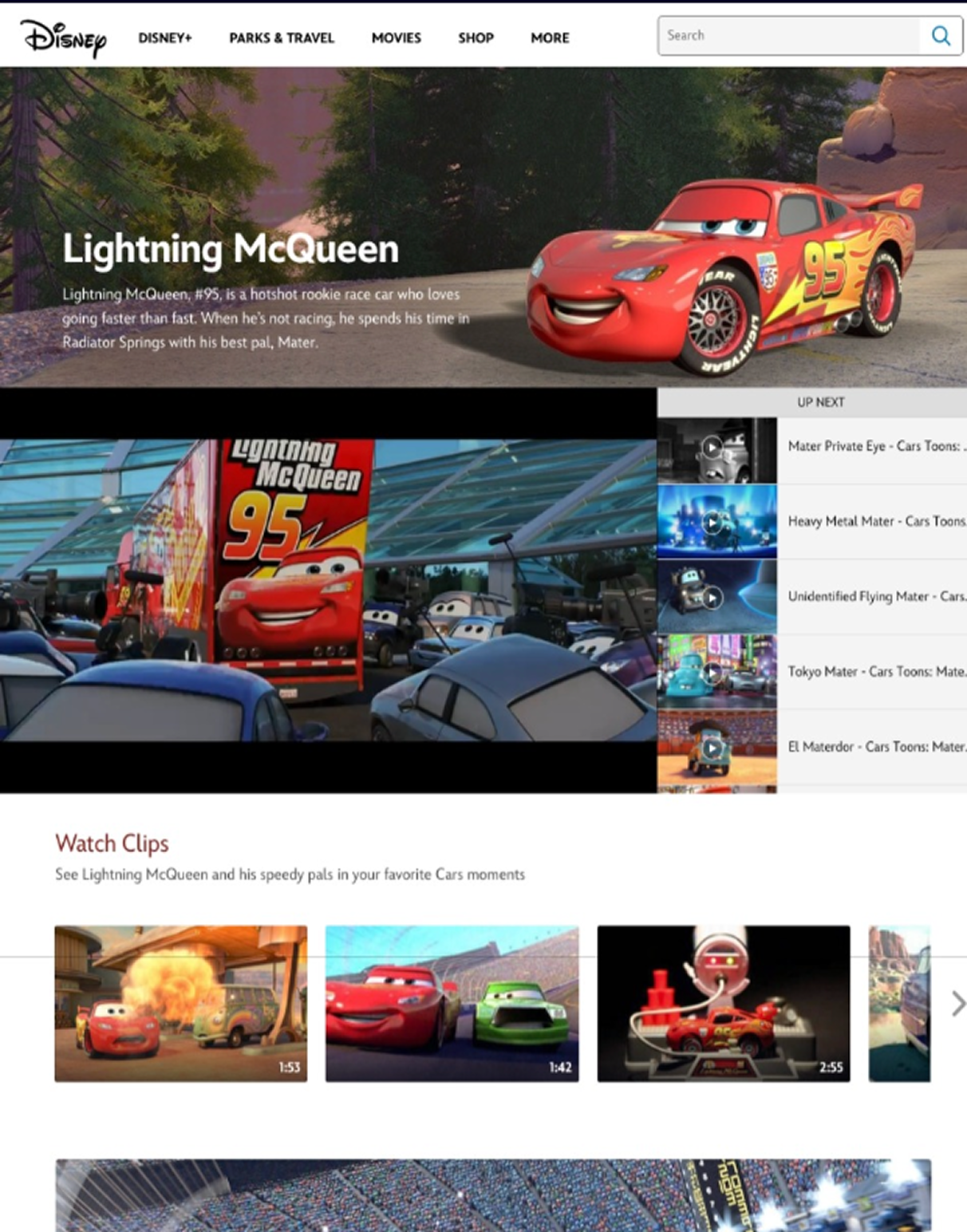
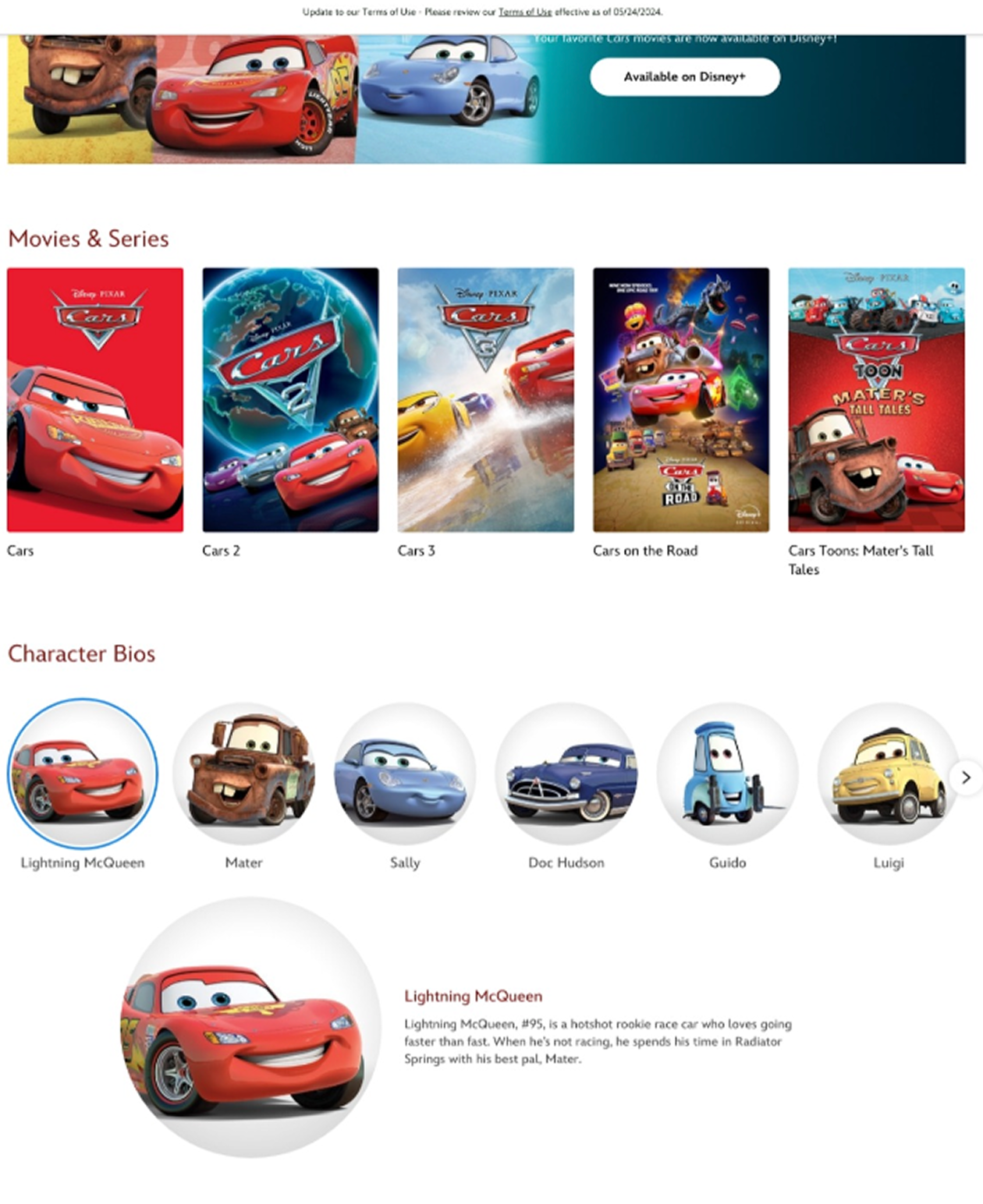
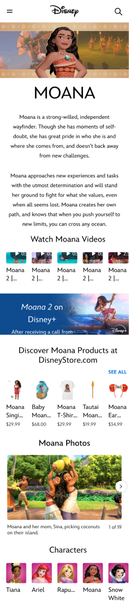
In 2023, characters had their own pages. Story, media, merch: room to go deep. Then production support shrank, those pages got unpublished, and everything folded into thin summaries with no unique URLs.
Fans lost a place to hang out with a character. Disney lost the SEO that used to bring people in, and the outlinks to Disney+ and Shop.
~60% SEO drop after character content got aggregated into one summary page without unique URLs.
Who needed what
I sat with product, production, design, and engineering leads before jumping into screens. Everyone needed something different.
- Product Grow SEO and traffic that could outlink to Disney+ and Shop
- Production A template that makes creating pages faster and simpler
- Fans A digestible, engaging place to learn, shop, and discover
Design one best-case page as a reference for bringing characters back without breaking production, or losing the magic.
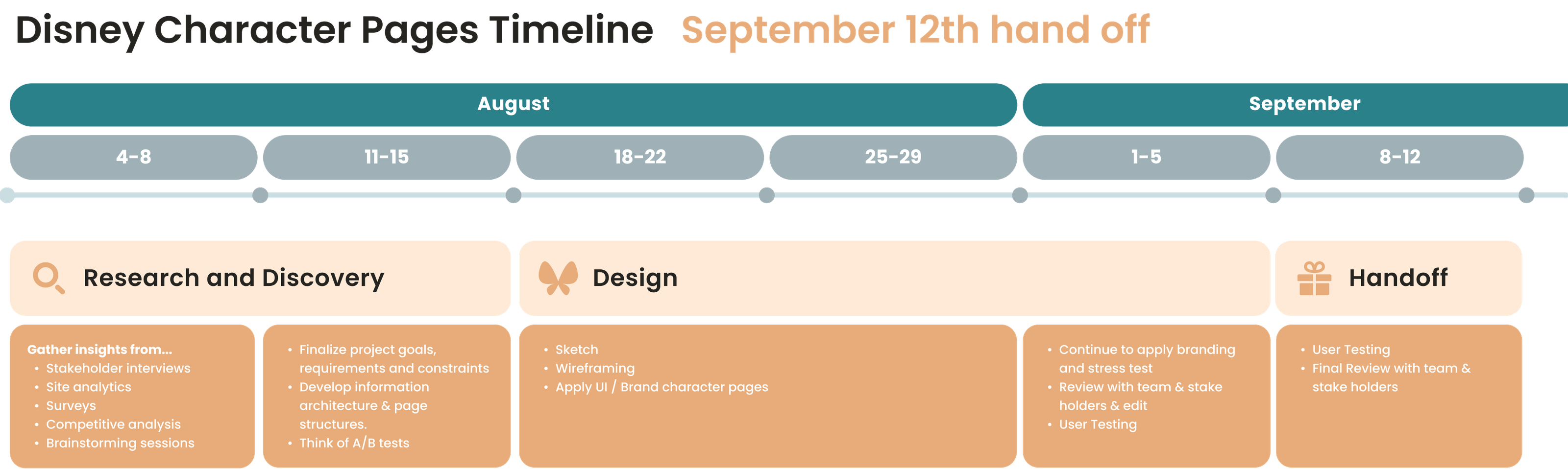
Six weeks to handoff
Research into design, then a September 12 handoff. Tight enough that every week had to earn its keep.
Digging in
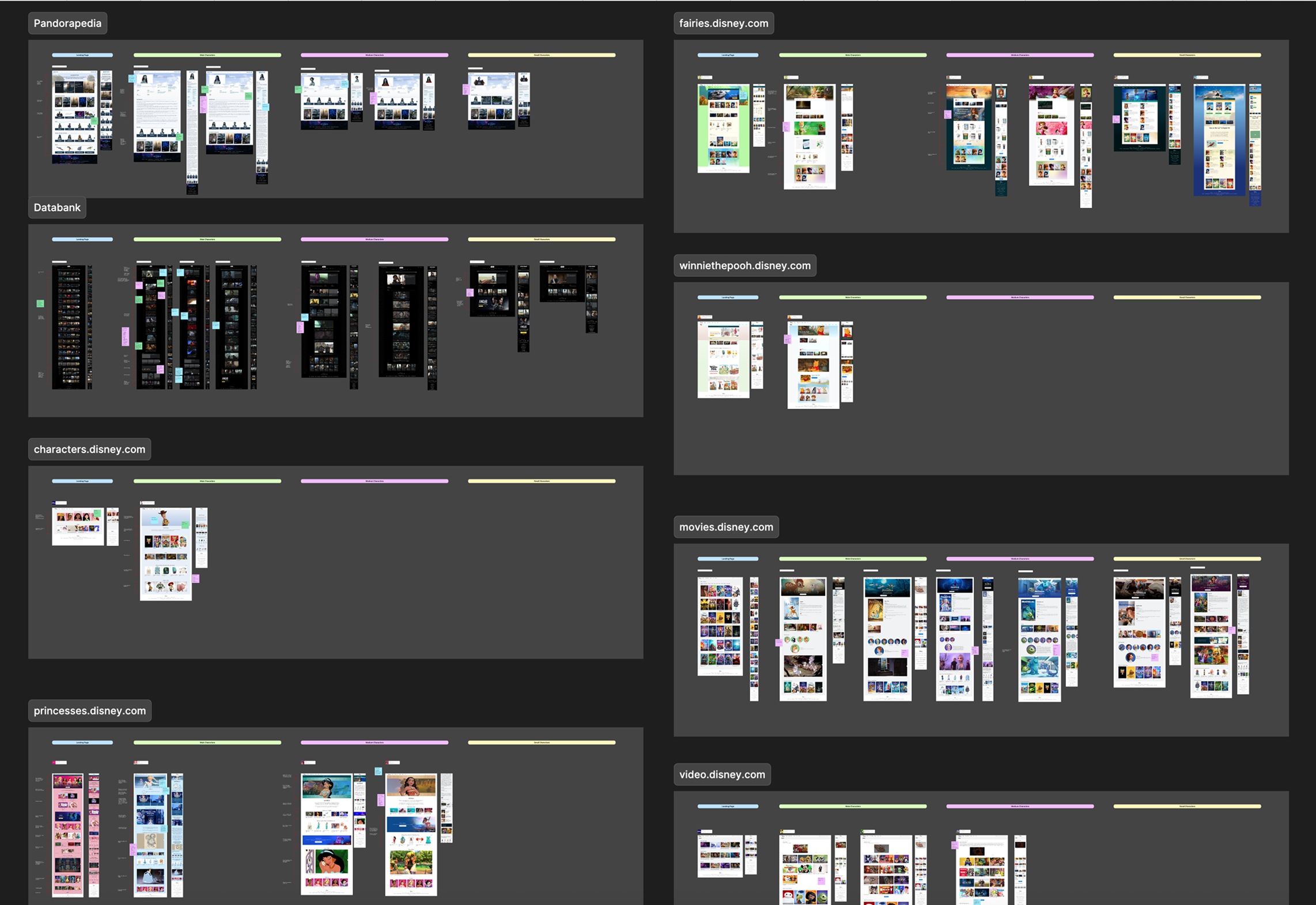
I audited character pages across Disney and competitors: how they organized content, what UI patterns showed up, and what still worked when a character had almost nothing versus a deep catalog.
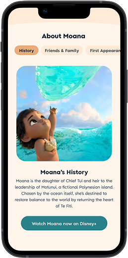
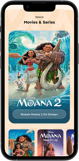
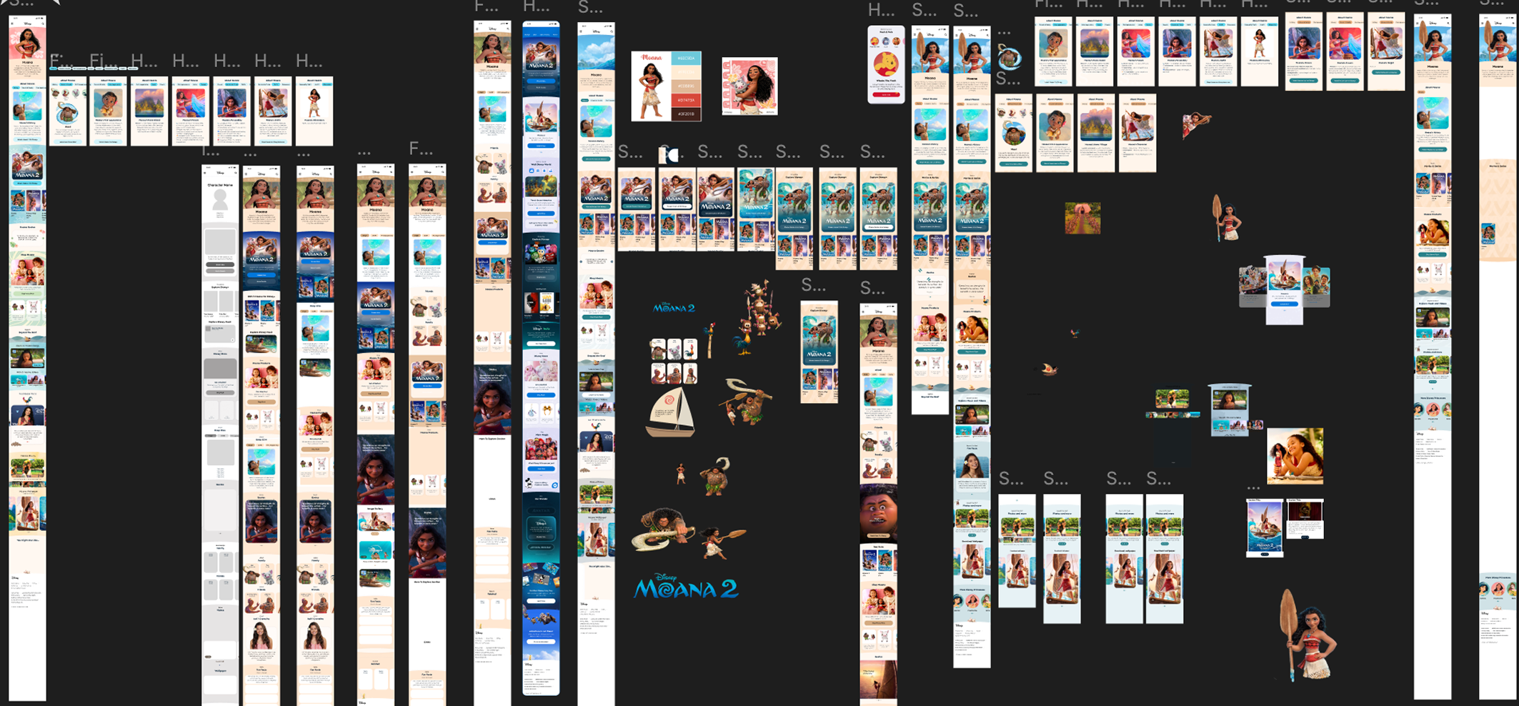
That shaped the hierarchy: About, Quotes, Fun Facts, Shop, Streaming, Related Characters, and more. Every section weighed against both business and fan goals.
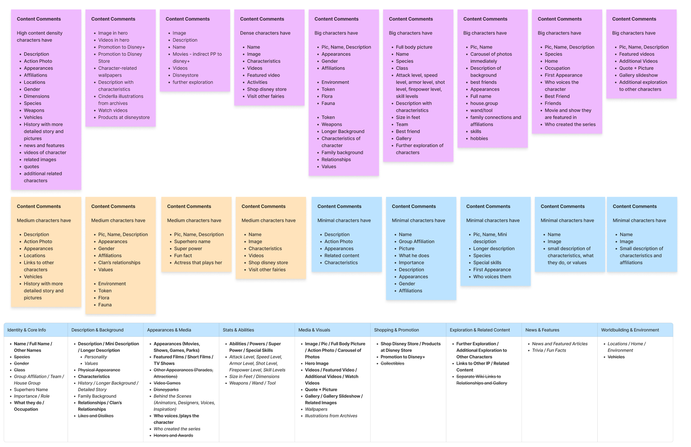
Structure before pixels
Competitive patterns, stakeholder goals, and how fans actually explore all fed the same question: what earns a place on a dense mobile page, and in what order?
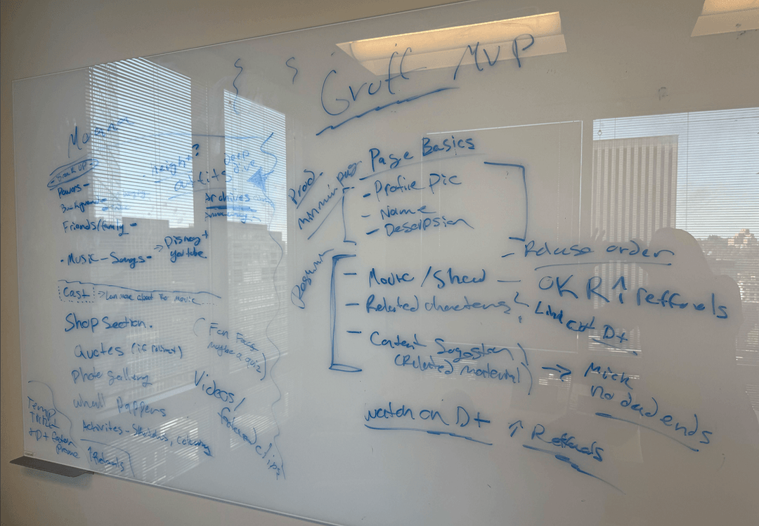

From there I moved into mid-fi wireframes, accessibility checks, and visual explorations inside Disney’s system. Trying module orders until the page felt scannable without feeling thin.
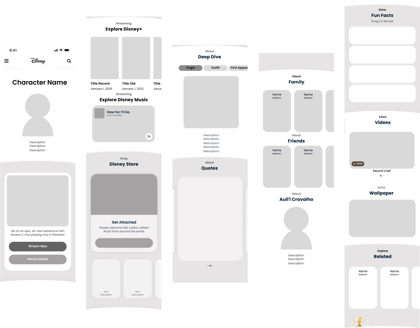
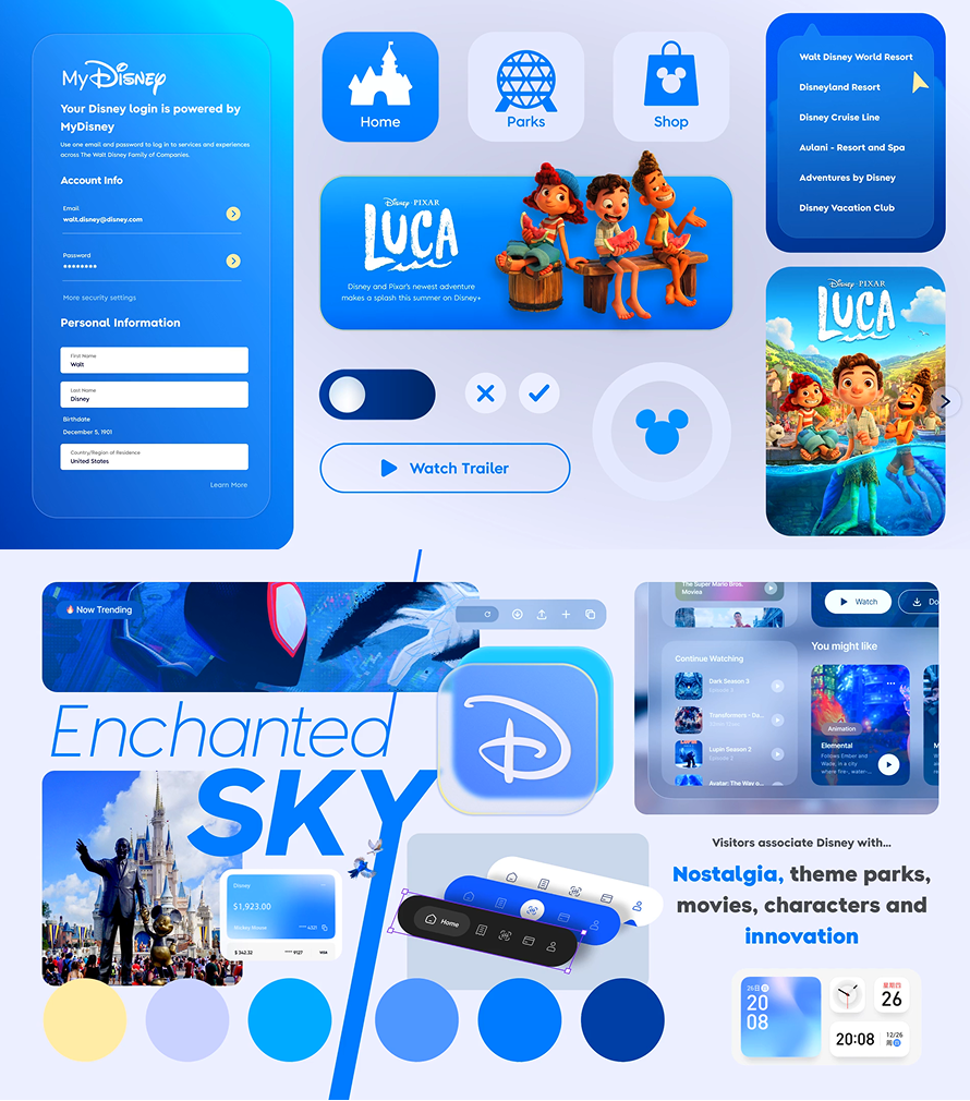
Making Moana feel finished
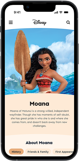
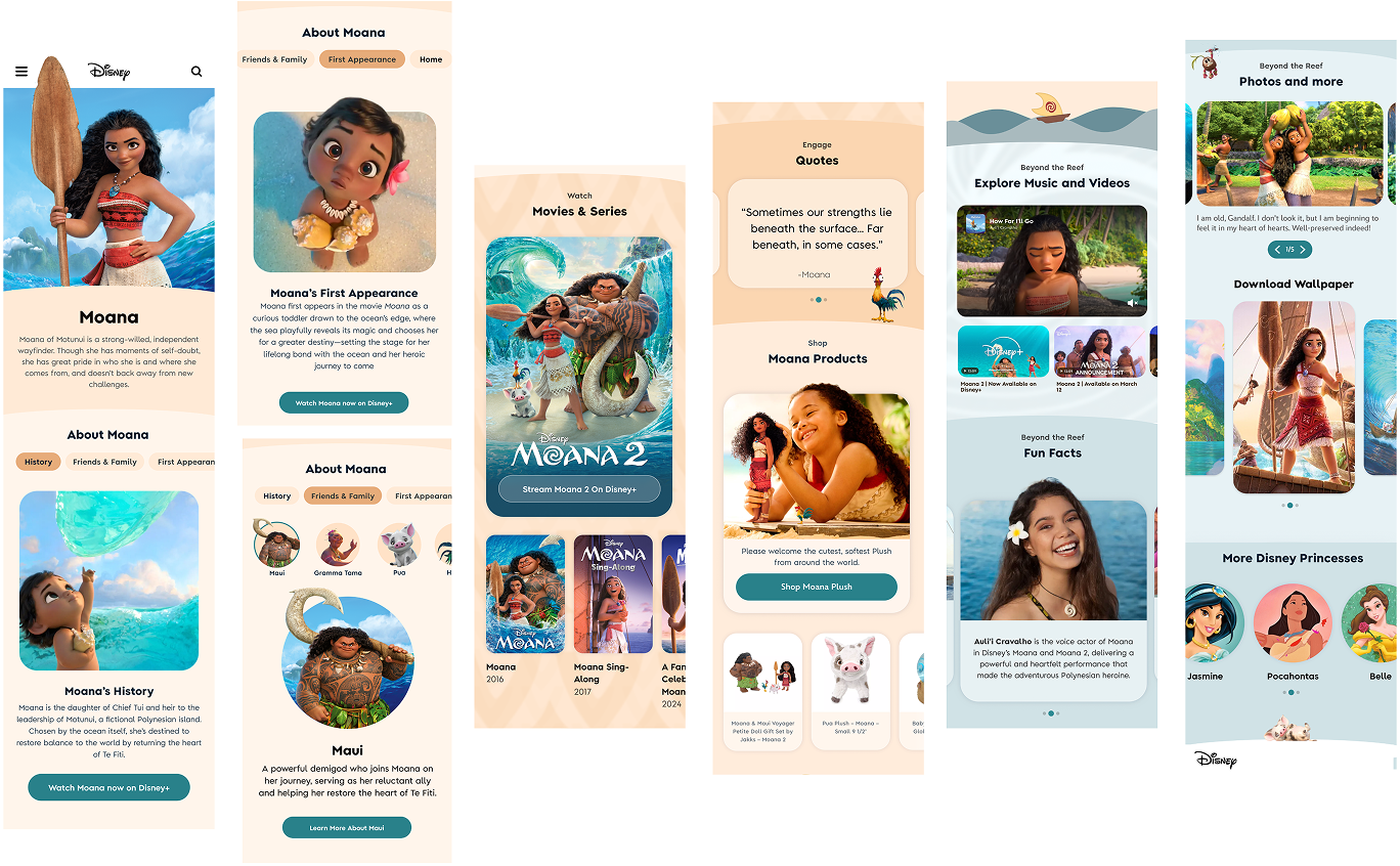
High fidelity wasn’t just polish. I needed a page dense enough to feel like Disney, modular enough to scale across IPs, and clear enough for production to reuse.
What fans and stakeholders said
On DScout, I had 10 people aged 30–49 explore two Moana prototypes (V1 vs V2) and talk through what they expected, liked, and still wanted.
10 / 10 preferred Version 2: richer, more complete, more “Disney.”
- History, fun facts, and quotes needed to feel more brand-true
- Music or voice moments would deepen immersion
- One continuous scroll beat jumping through a maze of links
- Theme-park and real-world tie-ins were frequent asks
“It has everything I’m looking for: story, merch, quotes, fun facts. It feels like Disney.”
“I love that everything is scrollable instead of clicking a million links.”
Producers and PMs wanted scalability across franchises and room for campaigns. That locked in modular templates, adaptable color systems, and reusable content slots. The page had to win with fans and still work as a system for 100+ characters.
What shipped
I left a high-fidelity character page that restores unique URLs for SEO, gives producers a clearer path to build, and gives fans somewhere worth staying: story, media, shop, and discovery in one scroll.
What I’d change
The hard part wasn’t making one beautiful Moana page. It was holding storytelling and scalability in the same hand: enough magic to feel like Disney, enough structure for production to run.
Impact
- Unique URLs reopen SEO and discoverability
- A modular system aimed at 100+ IPs
- Clearer, faster content workflows for producers
- Unanimous preference in user testing
Next
If I ran it again, I’d prototype and research faster. Less time in isolated craft loops. More time talking to users and adjacent teams.